Community Charts Screener Social Trends Insights Dev Activity Dashboard Watchlists Alerts Historical Balance
Pricing
Log in Sign up
insight thumbnail
@SanSights
12.12.2023
New Metrics Shed New Light on Understanding How a Network's Total Supply is Faring

New metrics that show how the total supply on a blockchain moves around over time, helping you get a better feel for what's really happening with the coins. Measures: Network total supply dynamics Reflects: How active the network is and how coins are spread out among users Interpretation: When supply movement goes up, it means more coins are changing hands and the network is buzzing; when it goes down, coins are being held tight and less is moving around Context: Commonly analyzed alongside on-chain transaction volume and holder distribution Tags: Category: On-chain Metric | Signal Type: Network Activity | Market Scope: Network-level

METRIC TUTORIALS
BTC
insight thumbnail
@SanSights
28.11.2022
One-Upping Your Buy Low/Sell High Game With MVRV Z-Score

The MVRV Z-Score helps you spot when an asset might be priced too high or too low, so you can make smarter buy or sell decisions. Measures: Market Value to Realized Value Z-Score (MVRV Z-Score) Reflects: How the price compares to its "fair value" based on what investors have actually paid, giving you a feel for whether the market is optimistic or cautious Interpretation: When the MVRV Z-Score goes up, the asset might be overvalued and could face selling pressure; when it goes down, the asset might be undervalued and could be a good buying opportunity Context: Commonly analyzed alongside price trends and on-chain volume Tags: Category: On-chain Metric | Signal Type: Valuation | Market Scope: Spot

5
METRIC TUTORIALS
DOGE
BNB
UNI
SHIB
insight thumbnail
@SanSights
02.11.2022
Bitcoin's Hidden Indicator - Social Dominance

Bitcoin’s social dominance shows how much buzz Bitcoin is getting on social media compared to other cryptocurrencies, giving you a quick sense of where people’s attention and excitement are. Measures: Bitcoin social dominance (share of social media mentions) Reflects: How much social media chatter and interest Bitcoin is grabbing compared to other coins Interpretation: When Bitcoin’s social dominance goes up, it means more traders and fans are focused on Bitcoin, which can signal stronger momentum or hype. If it goes down, attention might be shifting to other coins, so Bitcoin could be cooling off in the spotlight. Context: Often analyzed with Bitcoin price trends and other social metrics Tags: Category: Social Metric | Signal Type: Sentiment | Market Scope: Social

1
BTC
METRIC TUTORIALS
STRATEGIES/ALPHA
insight thumbnail
@SanSights
22.07.2022
Mean Dollar Invested Age: Dormant Coin Movement to Watch!

Tracks the average time since coins last moved, showing how long people are holding onto their coins without selling. This can help you spot when holders are confident or when they might be starting to give up. Measures: Mean Dollar Invested Age (average time dormant coins are held) Reflects: How long people are keeping their coins—longer times usually mean holders are feeling confident; shorter times suggest more selling or moving around. Interpretation: When the Mean Dollar Invested Age goes up, it means holders are sticking around and not selling much. When it goes down, it usually means more coins are changing hands or holders are losing confidence. Context: Often analyzed with Dormant Coin Supply and Coin Age Distribution Tags: Category: On-chain Metric | Signal Type: Accumulation | Market Scope: Network-level

5
METRIC TUTORIALS
STETH
TUSD
DOGE
LTC
insight thumbnail
@SanSights
20.04.2022
New Sansheets Model - Which Assets are Profits Being Taken On, and Which are Seeing Some Juicy FUD?

This insight shows which assets are currently seeing traders take profits and which ones are dealing with a lot of fear, uncertainty, and doubt (FUD) in the market. Measures: Asset profit-taking and fear, uncertainty, and doubt (FUD) Reflects: Money moving in and out and how traders are feeling Interpretation: When profit-taking goes up, it usually means people are selling to lock in gains; when FUD rises, it signals that traders are nervous or worried about the market Context: Commonly analyzed alongside on-chain volume and social sentiment metrics Tags: Category: On-chain Metric | Signal Type: Capital Flow | Market Scope: Spot

3
METRIC TUTORIALS
SHIB
SKL
SNX
ETH
@SanSights
15.09.2021
Social Dominance - Identify Which Projects are Getting Overhyped, Capitalize on Price Tops and Bottoms

Tracks how much buzz a project is getting on social media to help spot when a coin might be getting too hyped or when interest is cooling off. Measures: Social dominance (share of social media mentions per project) Reflects: How excited or calm the market feels about a project Interpretation: When social dominance goes up, it usually means more hype and possibly a price peak coming. When it goes down, the hype is fading and the price might be near a bottom. Context: Commonly analyzed alongside price trends and trading volume Tags: Category: Social Metric | Signal Type: Sentiment | Market Scope: Social

METRIC TUTORIALS
SOL
FTM
ADA
AVAX
@SanSights
17.03.2021
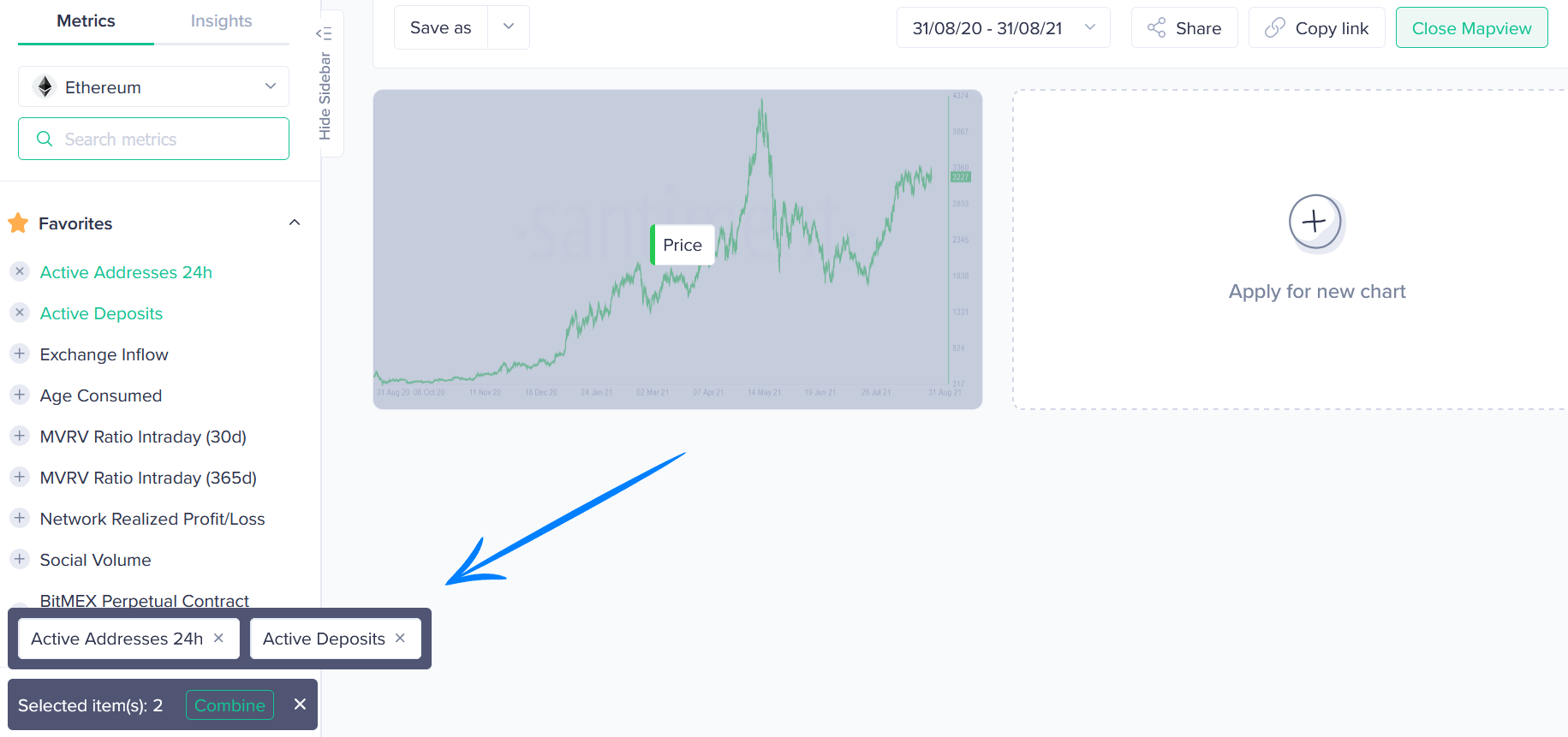
Exploring Active Deposits in Relation to Overall Active Addresses to Find Price Divergences

Analyzes how many active deposits there are compared to active addresses to help spot possible price moves before they happen. Measures: Active deposits, Active addresses Reflects: Money moving in and out, how active the network is Interpretation: When active deposits go up compared to active addresses, it might mean people are quietly buying (accumulating) and prices could go up. If the ratio drops, it could show people selling off (distributing), which might lead to prices falling. Context: Commonly analyzed alongside price and volume trends Tags: Category: On-chain Metric | Signal Type: Capital Flow | Market Scope: Network-level

2
ELF
MATIC
METRIC TUTORIALS
@SanSights
10.03.2021
Santiment's New 'Daily Active Deposit Ratio' Sansheets Model Explores a New Way of Understanding Address Activity

Santiment's Daily Active Deposit Ratio gives you a quick look at how many addresses are actively making deposits compared to all active addresses, helping you understand how engaged users are with the network. Measures: Daily Active Deposit Ratio (active deposit addresses relative to total active addresses) Reflects: How lively the network is and how much people are actually putting funds in Interpretation: When the Daily Active Deposit Ratio goes up, more people are actively depositing, which usually means stronger interest or confidence. When it goes down, fewer people are depositing, suggesting less activity or caution. Context: Commonly analyzed alongside Daily Active Addresses and Deposit Volume Tags: Category: On-chain Metric | Signal Type: Network Activity | Market Scope: Network-level

MATIC
ELF
SKL
METRIC TUTORIALS

We are using cookies to improve your experience!

By clicking “Allow all”, you agree to use of all cookies. Visit our Cookies Policy to learn more.